Do you feel like your online course sales are slow (or not even happening)?
You're just a simple fix away from online course success. Find out WHAT you need to fix in this free course audit.
Grab your free course audit!
Blog Categories
I'm an online marketing coach and launch strategist who loves helping female grow successful online businesses!
Hi, I'm Lou!
Do you have a free offer that you’re using to grow your email list, but despite all your efforts you’re not getting as many sign-ups as you’d like?
Maybe you’re looking at your ads and they seem to be doing well in terms of clickthrough rate and cost per click so it doesn’t really make much sense why you aren’t seeing the leads roll in.
There might just be a little factor that you’re missing. This is something that is easy to measure (if you know how) AND easy to fix.
That little piece of information is your landing page conversion rate.
Often it just takes some simple tweaks to get your landing page, your sales funnel and your ad campaigns humming again.
This blog is specifically about a landing page for a free product/offer. This might be a lead magnet, a free challenge, a quiz, a case study opt-in, an eBook or a checklist. This is different from a sales page or a normal page on your website, as the conversion rate benchmarks I’ll be mentioning are different.
Firstly, we need to know how to calculate this number.
How to calculate your conversion rate
A conversion rate for a landing page is the percentage of people who view the landing page that actually convert. You calculate it by ‘number of conversions’ divided by the total number of visitors to the page, and then multiple it by 100 to get the percentage.
Number of conversions / total visitors x 100 = your conversion rate.
There are industry benchmarks for landing page conversion rates, and I could find lots of data them online. However they seemed ridiculously low, with many blogs reporting that the average conversion rate was 1.3%. I believe many of these are for paid products. From my experience in digital marketing, this is NOT the case for a free offer.
What’s a good conversion rate for a landing page?
For a free offer, ideally you have a conversion rate of the very minimum 20%. This means that of 100 people who visit your page, 20 will opt-in.
You might be thinking this isn’t much…and you’re right.
And this is why it’s vital to keep an eye on this number.
I have been able to get up to 80% with landing page conversion rates for a free offer, so in this blog post I’m going to walk you through step-by-step exactly what I did to achieve this.
Before we dig in, just note that conversion rates can also vary based on how warm the traffic is that you’re sending to it. For example, if you send a free offer to your email list, they are likely to convert much higher than traffic you’re getting from paid ads if you’re targeting a completely new audience.
Basics of a high converting landing page
There are some basic landing page no-no’s, so before we get into the nitty-gritty, let’s take a look at those.
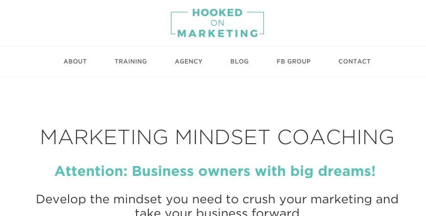
A landing page should have no navigation or menu at the top of the page, like a regular website page does.
Let’s take a look at an example of a landing page that does have navigation:
And now one that doesn’t:
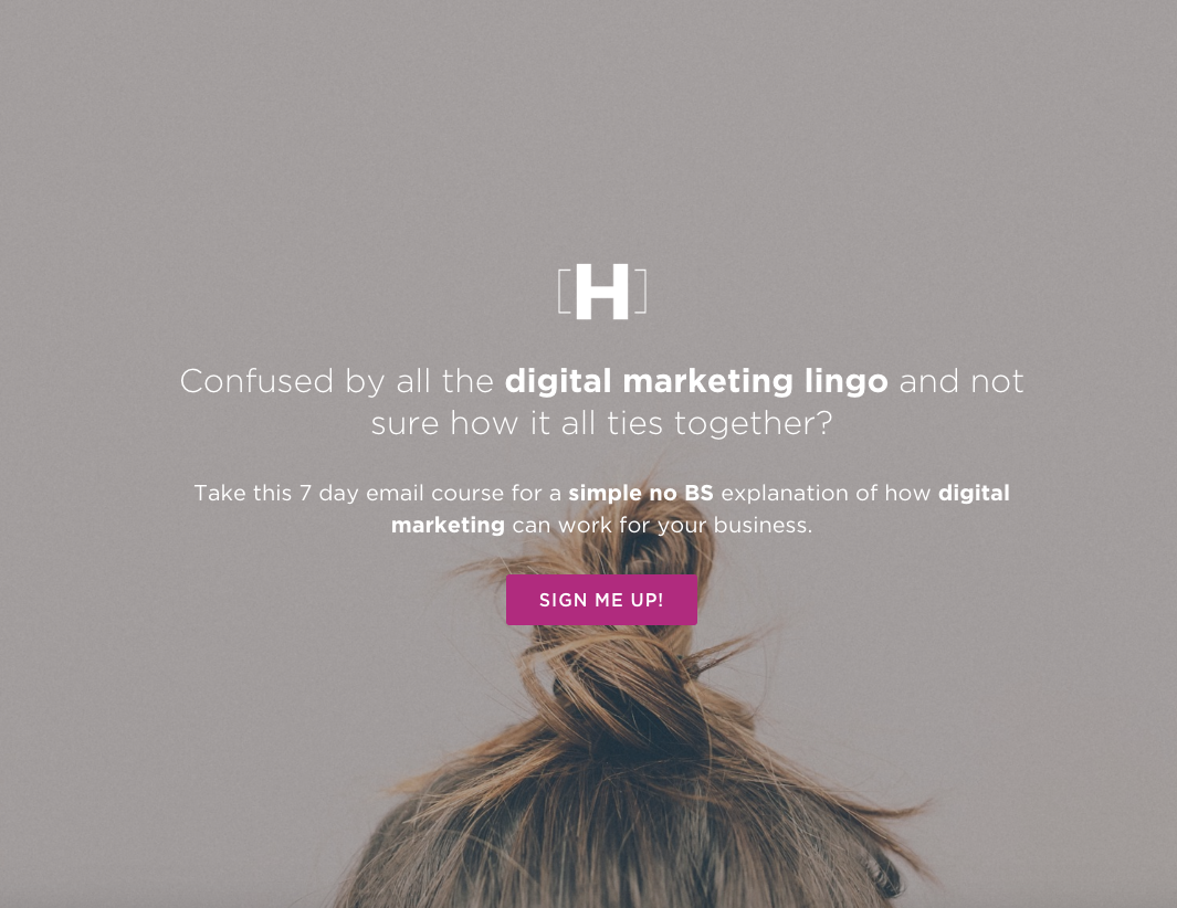
The reason to NOT have website navigation on your landing page is that it’s a big distraction to go clicking on links to elsewhere on the website…most often never to return to this page again.
Ideally there is one clear call to action on the page, and no links pointing anywhere else at all.
Most website builders have a facility to create a landing page without navigation, or you can also use landing page builders like Clickfunnels or LeadPages.
Another vital part of a good landing page is to not link off to other pages from anywhere within the page. For example, if you want to add a little about yourself, don’t go linking to your website About page. As with the scenario above, if they click off this page to head to your About page, it’s highly likely they will never return!
Instead, create a specific bio that sits on the landing page itself – the bonus of this is that you will be able to tailor your bio specifically to your free offer.
How to improve your landing page conversion rate
Rather than simply give you a list of improvements you can make, I’m going to show you real-life improvements I made to one of my own landing pages.
Here is the first version of the landing page. The free offer is my ‘SEO Your Website in 5 Days’ Challenge.
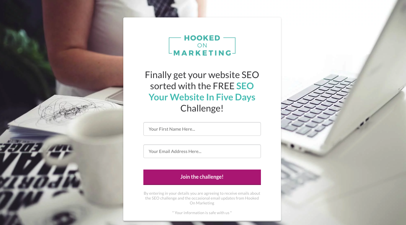
It’s a simple form that sits on a background image. The form is embedded onto the page, so there is no pop-up to fill in the details.
Overall this landing page worked well and was super simple. The conversion rate started off at around 50% to a really warm audience, the people who already knew, liked and trusted me. This conversion rate was a combination of that really warm audience and a good offer.
BUT I did start to notice that the conversion rate was starting to drop after my most engaged followers had signed up for it. And I had an inkling that I needed to work on improvements if I was going to convince a colder audience to sign up to this challenge. After all, it's not a simple download and they've got the thing. A challenge takes a commitment, in this case for 5 days.
So I went about making some changes, literally starting from scratch.
The new format was completely different. It went from a landing page where you could see the entire page on your screen to a longer form page that required the visitor to scroll through the sections.
In this first section, I added a picture of me so a potential new challenger would know who was running the challenge and be able to put a face to the name.
This is the top section below:
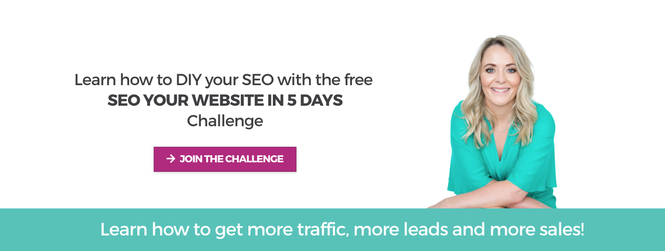
I also created a button that then opens up a pop-up. Note in the first iteration of this page, the form was embedded on the actual page instead. Now the form is on the pop-up, so there’s an extra click involved. Throughout all the sections of the page, there are now three different buttons that lead to this pop-up. I also made this an exit-intent pop-up. So if someone goes to leave the landing page, this pops up on the screen.
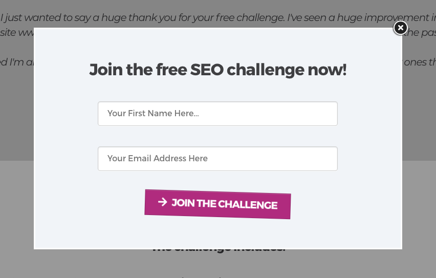
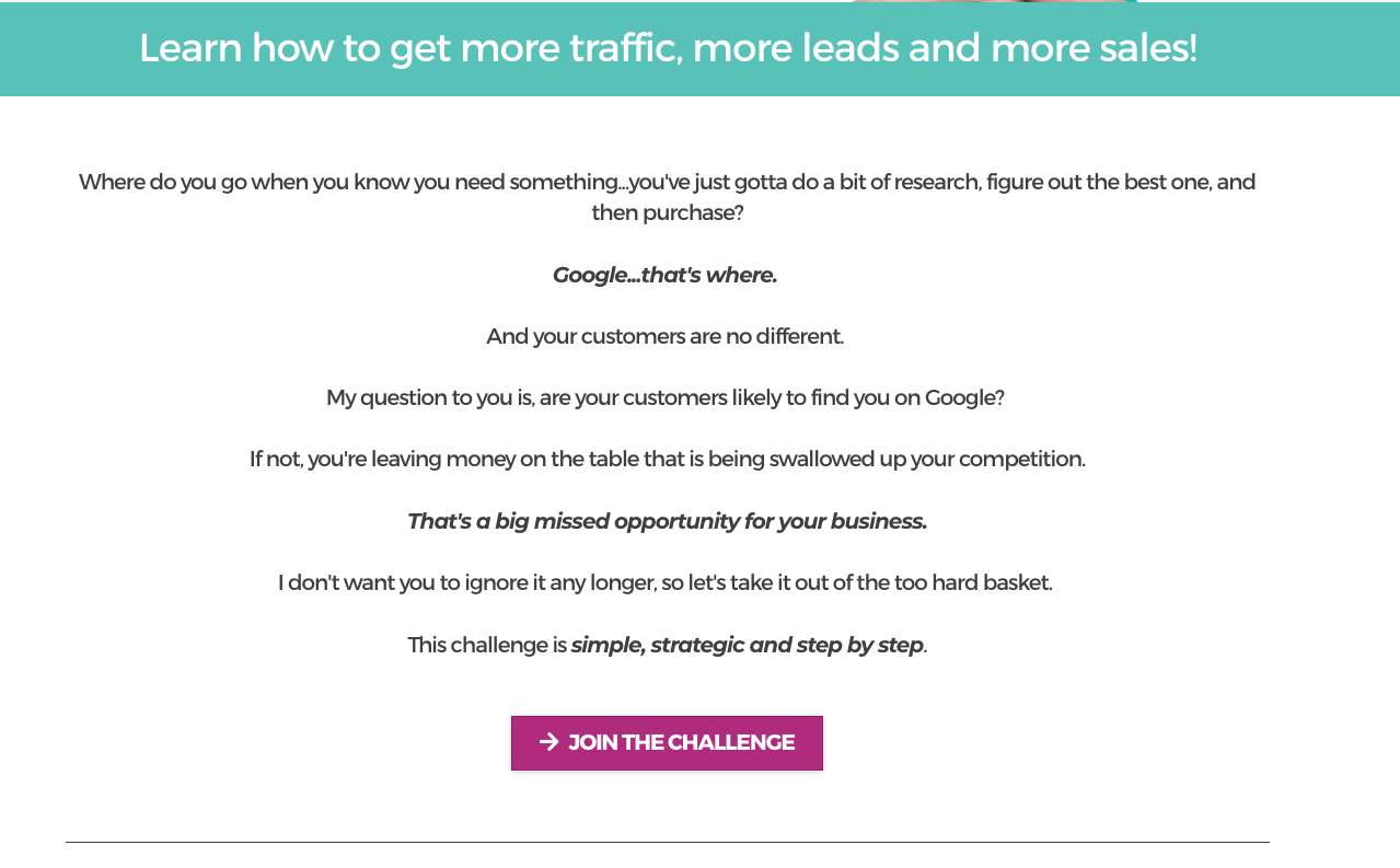
After this opening header section, I added a section of copy that really drills down into the main reasons people need SEO in their business. I find that many people avoid it as they believe it’s complicated and too hard…I know that it’s not so this section is all about busting that belief.
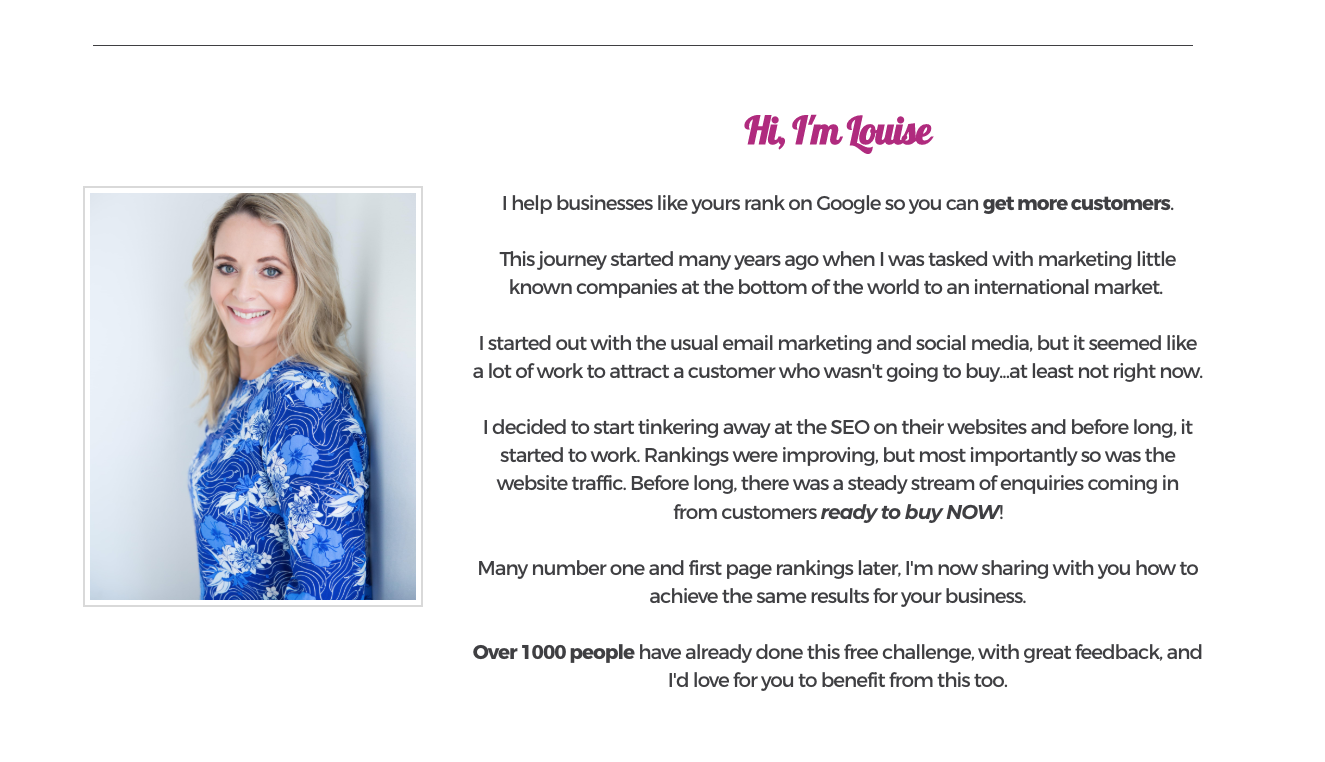
Then is then followed by a section about me. As I mentioned earlier, do not simply link to your about me page for this – once a visitor is off this landing page, it unlikely they’ll come back.
Instead I craft a unique ‘about me' blurb which is very specific to this offer. After all, I offer much more than SEO but I don’t need to go into that on this page. It’s all about my experience and wins with SEO, and my passion for teaching others.
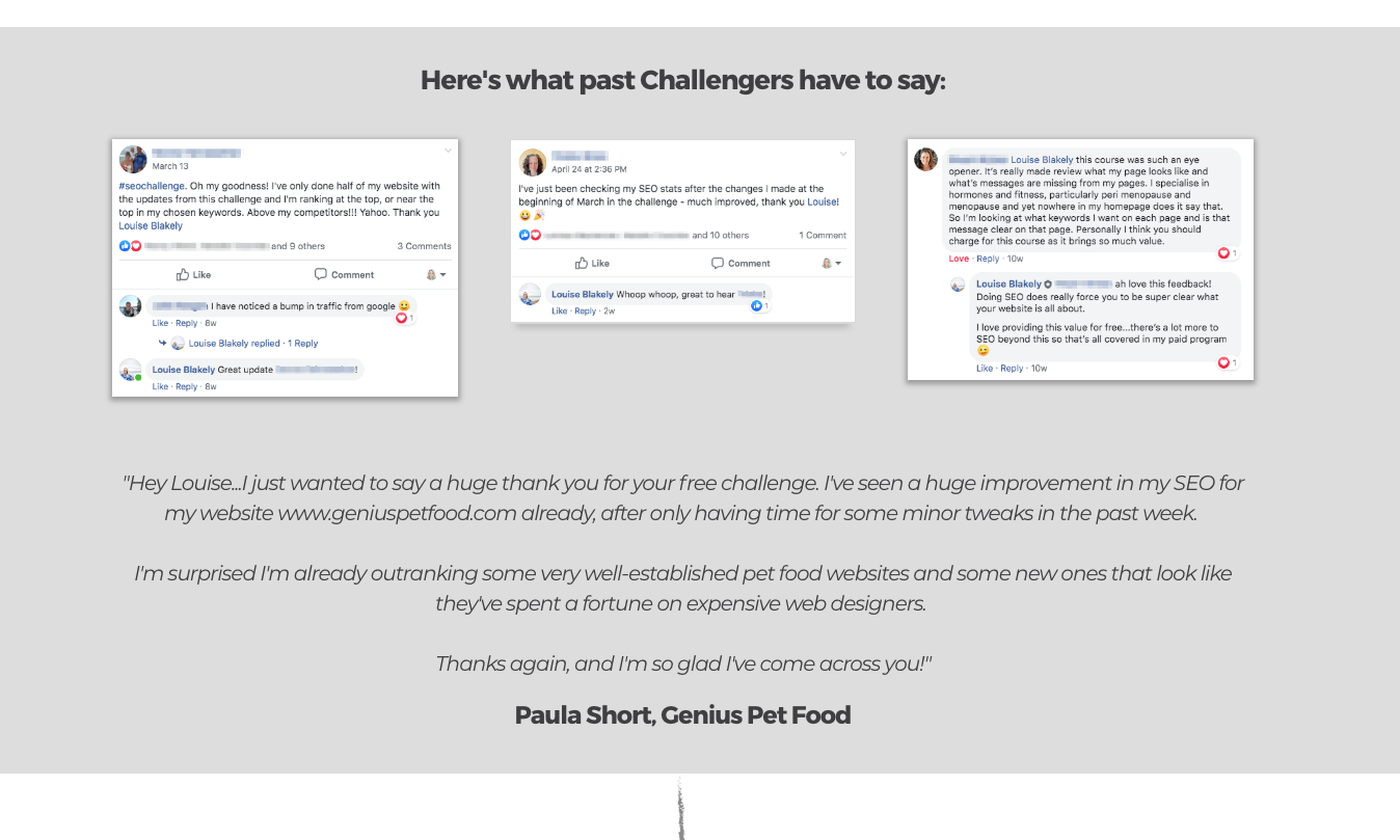
Then it’s onto the social proof section. Social proof is one of the most important parts of any landing page, and you’ll note that on my first version, I had none at all. So adding this was a must. Luckily by this time I’d had many people do the challenge with great success.
It’s so powerful because it’s real people talking about their results. While you could talk about how great your free product is until you’re blue in the face, someone else saying how great it is is priceless!
So adding this section is an absolute must!
Then the final section bullet points exactly what you get in the free challenge. The idea here is to make it super clear, setting expectations so that people know what they get.
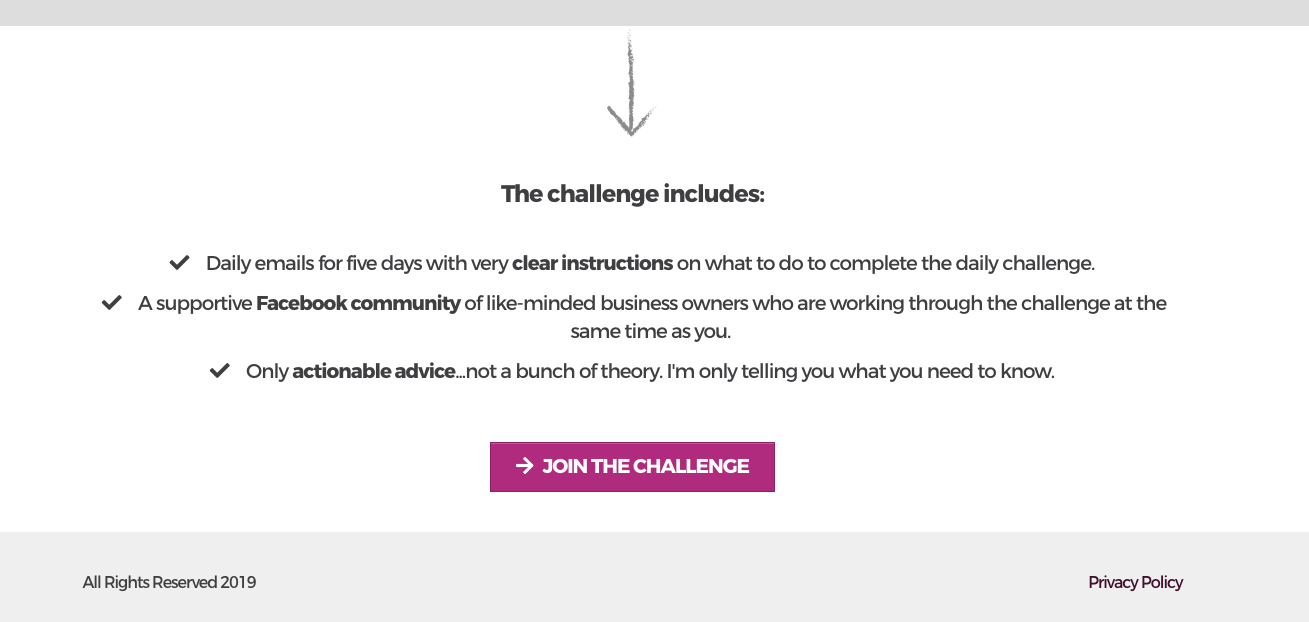
To summarise, the improvements I made to the landing page were:
- Adding images of myself so people knew who I was and my face.
- Changed the form from being embedded in the sign up page to popping up once the visitor clicked on the button.
- Added three different Call to Action buttons throughout the page.
- Set the pop-up so that it showed automatically when a visitor went to exit the page (exit-intent pop-up).
- Created a copy section digging into why people should care about the topic of the free challenge.
- Created a section about me, with another image, that is specific to this free offer.
- Added testimonials from people who have completed the challenge in the past, and have experienced great results. These included screenshots from the Facebook group and a written testimonial.
- A summary list of exactly what is included in the challenge.
- Added a privacy policy link in the footer (this is vital if you’re using FB ads).
Other things I could have done if I needed to:
- I could definitely connect with visitors on a deeper level by adding a video summarising what the challenge is and why they need it to the top section of the page.
- I could add media logos to build trust.
- If I didn’t have social proof specific to this particular challenge, I could have added some more general testimonials that I’ve gained during my time in business.
The results – a high converting landing page!
Initially I tested these two pages against each other using the split-test feature in Clickfunnels – I love this feature! As I mentioned earlier, the conversion rate of the first page was around 50% but started decreasing over time. I also just knew it wasn’t substantial enough.
The new improved page was an instant winner, with a conversion rate with warm traffic of around 80% straight off the bat!! Amazing!
I made sure I had enough data before I declared the winner officially and made this the main landing page for my free challenge. In order to make a good decision here, you need at least 100 viewers of each page.
What am I going to do next?
The thing I’m interested in doing next is adding HotJar to this page to monitor where people are clicking.
I think playing around with the order of the sections could be worth looking into, as the final section of what’s included would be useful to a viewer higher up the page.
And I’m also keen to set up a new split-test within Clickfunnels to test out variations of the headings. I haven't really done any work on that side of things so far.
It’s all about the optimisation, baby! And this isn’t a one and done process. It’s iterative. You should always keep an eye on your conversion rate, and take action where needed.
Never assume that it’s bad ad targeting or a bad offer that's responsible until you’ve collected all the data. Low converting landing pages are a notorious blocker in a sales funnel and can also guzzle your ad budget.
I don't want to experience this and with the easy tweaks, you can improve your landing page conversion rate in no time.